
Designing a Better Columbia Health Experience Through UX Research
The Columbia Health website helps students find health-related information, from treating a common cold to responding to a serious traumatic event. To help users of the Columbia Health website find medical information quickly and easily, we partnered with Campus Services to redesign the site and update the content. We made commonly used tasks — like scheduling an appointment and finding service providers — easier to complete. Our research was based on surveys, interviews, and usability tests with students and staff.
Findings
Our research identified quite a few pain points:
Information about services was difficult to find.
The content required too much scrolling and needed to be refreshed. For example, students didn’t know dental and eye exams were covered by their insurance.
Scheduling an appointment was difficult.
The information architecture wasn’t intuitive, and too many clicks were needed to get to pertinent information.
Information about clinicians was hard to find, and required more than a few clicks.
The site didn’t include daily clinic hours. Users didn’t know how long a clinic would be open on a given day, or when it would be open for a future visit.
Recommendations
Based on research findings, the redesign included the features listed below.
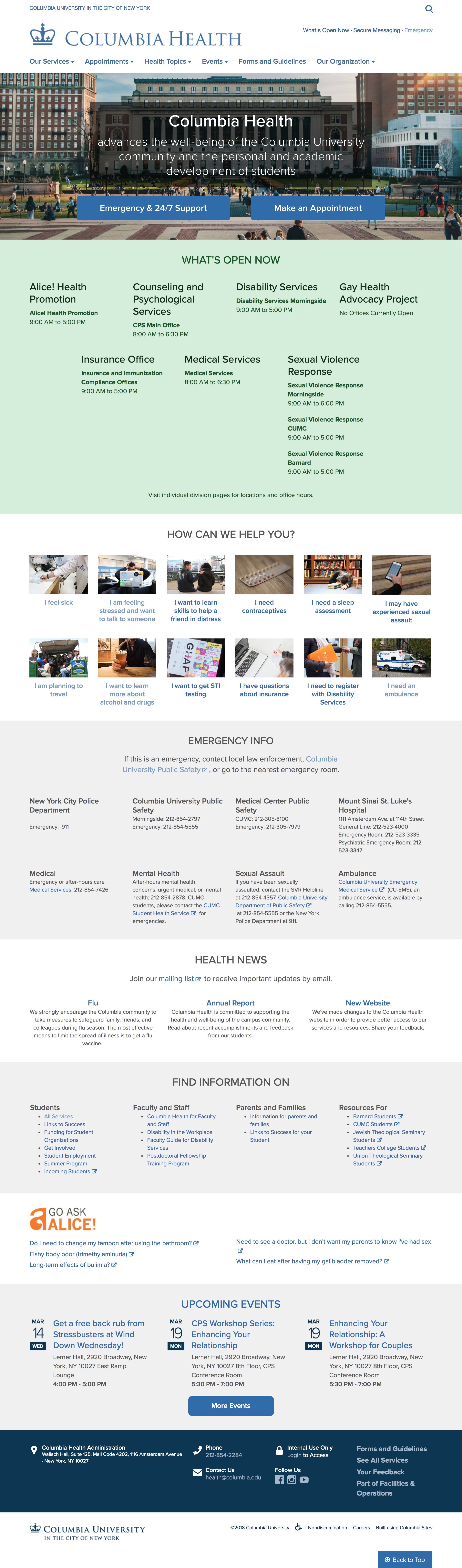
Users now have multiple paths for discovering services on the website: through navigation, landing pages, and the homepage.
The 12 most requested services are highlighted in a section of the homepage labeled “How Can We Help You?”
Emergency information and private messaging are listed on the utility bar at the top right corner of the page for consistency and accessibility.
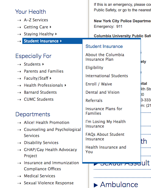
Locations, office hours, and links for scheduling an appointment are featured in the sidebar on relevant pages, making them easy to find.
The content was edited and updated in collaboration with subject matter experts.
The site is built on the Columbia Sites platform to meet brand and security guidelines efficiently.
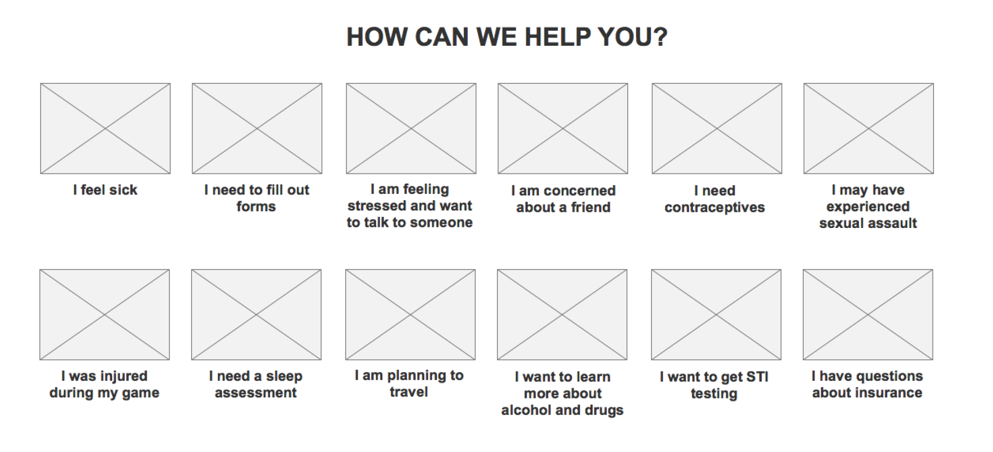
The top most requested services featured at a "How Can We Help You" section on the homepage.
Location, office hours, and scheduling an appointment are featured in the sidebar on relevant pages, making them easy to find.
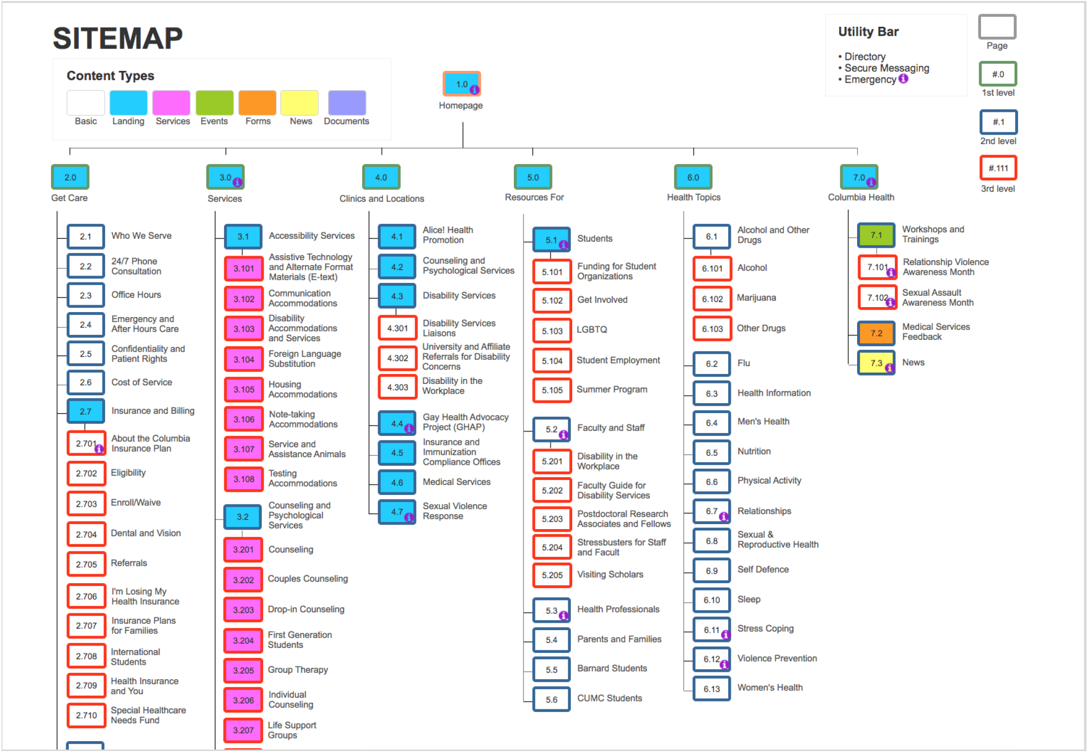
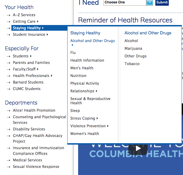
First version of the information architecture before the usability test.
Pre-Launch User Testing
We did two rounds of iterative user testing prior to the actual site launch using the same set of tasks from the benchmark testing six months earlier. Three-to-five users were included during each round, two weeks apart, to give us time to refine the site for the second round of user testing.
User Testing Tasks
You are feeling ill. How would you schedule a medical services appointment?
A fellow student has been sexually harassing you. Where on the Columbia Health website would you find resources to help you?
You are under a lot of stress. Where would you find information about coping with stress?
You are a new undergraduate and received a letter from your school reminding you of required immunizations. Where would you find information about immunization requirements on the Columbia Health site?
What is the process for enrolling in student health Insurance?
You are a new student at Columbia and are interested in registering for disability services. Where would you find the Disability Services registration form?
If you needed to be tested for HIV, where would you find information about Columbia Health testing services?
You are having issues sleeping due to the stress of finals. Where would you find information about managing sleep issues/insomnia?
Where would you locate the bio for Dr. Kori Bennett?
The usability test revealed a few design flaws with the information architecture:
Users were confused. The term “Get Care” was ambiguous.
The categories under “Services” were confusing. Users were expecting more information, such as location and office hours on these pages.
“Resources for” had a number of outbound links and was not intuitive. Users would generally come to this section to look for information once they couldn’t find what they were looking for under “Get Care” or “Services”.
Students expected to find service information under “Health Topics”. We recommended cross referencing.
Our second round of user testing came two weeks after we had received the first usability report, and we had an opportunity to implement changes based on those recommendations:
“Our Services” was moved to the far left of the navigation, exposing Top Services within the navigation.
The content was edited and updated in collaboration with subject matter experts.
We exposed “insurance” as a service, a health topic, and also as a health unit under “Our Organization” to make this information easier to find.
Since the Columbia Health site hosts events throughout the year, we exposed that information to students immediately by adding “Events” to the primary content.
“Appointments” was made a primary navigation item. We wanted to make it easier for users to make an appointment online, have a walk-in appointment, and get emergency after-hours support.
We saw significant improvement during the second round of user testing. Most tasks were completed with the highest rating, a 7.
View the Columbia Health website at health.columbia.edu.
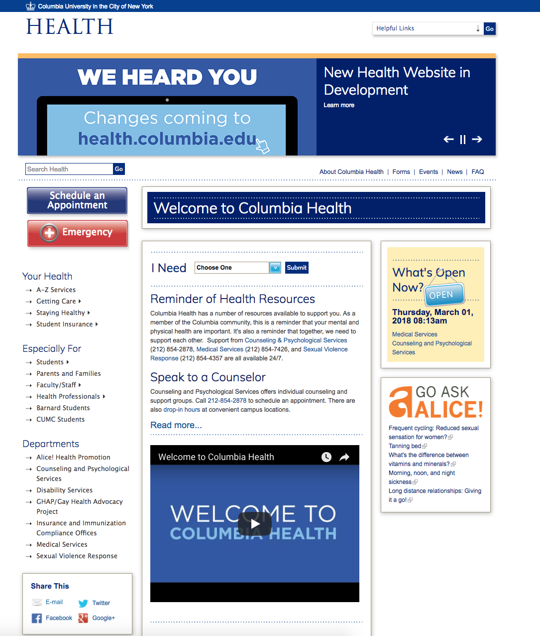
Columbia Health homepage at launch.